ShopDreamUp AI ArtDreamUp
Deviation Actions
I think one of the most complex subjects facing artists is color theory. Its a life long pursuit to understand all the nuances of color and yet it can produce the most benefit to the artist. One of the most frustrating experiences of new artists is seeing a color on the model or still life and having little understanding of how to go about mixing that color. Nothing can be more intimidating to the new artist then range of colors they encounter the first time they go to buy supplies... what colors do you need... where to start?
Color can be simplified into some basic concepts that can greatly improve an understanding of color theory and provide some guidance. This primer will be a concise overview of color but to truly understand color, nothing can take the place of experimentation. One of the most useful things you can do to master color is to make color charts of your working palette. In these color charts you should pick one color, say ultramarine blue, and mix it with every other color on your palette to see the resulting mixes. By doing this you will truly comprehend what colors can be produced by your palette. I would recommend when first starting out that you use a very limited palette of one yellow, one blue, one red, black and white and to force yourself to mix all the secondary colors: ie greens, purples and oranges. This alone will simplify your palette and increase your knowledge of color immediately.
To start let me define some basic terms relating to color. When you are trying to match a color you see there are several factors that must be considered. First off what is the hue, or what color is it... red, green, blue, etc. The second consideration is value, is it light, medium or dark value.

In the first line I have taken a color, vermilion and mixed a range of values from light to dark by adding white to get lighter values and by the addition of black to produce darker values. This is the second consideration of color.
The third consideration when deciding what color you are facing is the issue of intensity. Intensity refers to whether a hue is of full strength or has been neutralized or greyed thus lowering its intensity. The intensity of a color can be altered by adding black, white or by the addition of its complimentary color. The compliment of a color is the color directly across from it on the color wheel. Blue/orange, yellow/violet and green/red are all complimentary colors.
The last consideration is of course temperature. Temperature refers to where a color sits on the color wheel. Yellow, orange and red are typically referred to as warm colors while blue, green and violet are cool colors. To confuse the issue more however a warm color can have a cool version. Take for example red... an orange based red is typically a warm red while a blue based red would be cool.

In this example I am mixing two compliments to lower the intensity or neutralize them. Some interesting observations can be made regarding how temperature affects intensity. In line number 1 I have combined a warm red (cadmium red) with a warm green (Sap green) as the two colors approach the middle they are combined in roughly equal amounts and you can see this results in a neutral brown. However in row 2 I have now combined a warm red ( cadmium again) with a cool green (thalo green) this time. As we approach the middle we see this time that the combination of a warm and a cool temperature will produce a neutral grey not a neutral brown. In line three I am now mixing a cool red (alizerin Crimson) with a cool green ( Thalo ) and again I get a grey neutral, although a slightly different grey then before. The last line mixes a cool red ( alizerin ) with a warm green (sap) and the neutral here is again brown. So what can we learn that is of value here? A good rule of thumb, when mixing neutrals is that a warm/warm or cool/cool mix of temperatures will produce a brown neutral whereas a warm/cool or cool/warm will produce grey. Notice how beautiful the range of neutral browns and greys are produced by mixing neutrals rather then by relying on brown or grey out of the tube.
Now that we know the four considerations when determining color (hue, value, intensity and temperature) we can look at how all this theory can help us in a practical way.
When first beginning to paint I usually have my students produce a monochromatic value painting. This way they can become familiar with the feel of the paint and just concentrate on one aspect of color, in this case value. Since this eliminates color, it more closely resembles drawing. I usually will have them do a monochromatic painting using a mix of terra rosa and burnt sienna on a toned canvas, but any color will work. The technique I use is to wipe out areas that are lighter in value with a rag or a small brush with a bit of turpentine on it. An example of a monochromatic painting is below.

After students have an understanding of value, I have them move on to what I call a temperature painting. This is actually more difficult to produce then a full color painting in some ways. The actual color is replaced by a palette which uses complimentary colors to produce a neutral grey. In this case I use a palette of Blue/Orange or Ultramarine blue and Burnt Sienna. An example of this palette and the range of colors it can produce can be seen below.

On the right you can see the burnt sienna and on the left is ultramarine blue. I have added white to each mix so that you can see how the color changes over a range of values. As the color move to the right you can see a blue/grey, a neutral grey in the middle, and a warmer red/grey on the left. This range of temperature shifts can produce a remarkable range of color. By using complimentary colors we can use simultaneous contrast which means that complimentary colors when used next to each other produces a optical vibration thereby making them appear more intense.
You can use this concept to make a painting, or selected colors appear more intense then they would normally. Advertisers use this theory all the time. Here is an example of a temperature painting using only ultramarine blue, burnt sienna, white and black.

In this example the underpainting was original a toned canvas of burnt Sienna, you can see a bit of the original canvas in the upper right corner. The grey of the body was painted over the burnt sienna and while it was an absolutely neutral, non chromatic grey, it has temperature shifted to appear blue grey because it was over-painted on a warm surface. So thereby it is optically shifting in temperature from neutral to cool. This is very complex color theory so it may take a bit to understand its implications to painting, I would suggest if you want to understand it completely that you try a temperature painting yourself.
This is another example of using temperature to create more intensity in an all white object. Here I have shifted the greys to be a warm grey (more burnt sienna) or to be a cooler grey ( more blue) this shifts causes simultaneous contrast which in turn makes the colors vibrate and look more intense then if I was just using a flat grey mixed from black and white.

Now to talk a little about color palettes. When my students first attempt to color paint I have them use a limited palette. This enables them to understand how to mix their own green, purples and oranges rather then relying on tube colors. (In actuality I never use tube greens, oranges or purples but rather I mix them all myself because I prefer the natural variations of color that occur in mixed paint).
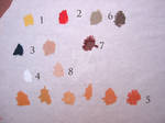
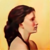
This palette uses a limited color palette of naples yellow (1), vermilion or cad red (2), black (3) and white (4). With this palette you can produce a variety of flesh tones that will successfully reproduce a figure. It is a simple palette to master but will produce very sophisticated results. In (5) you can see a range of yellow to red flesh tones produced by combining red, yellow and a touch of black. To make a redder flesh tone add more red, to make a yellower flesh tone add more yellow. To make a neutral flesh tone that is neither yellow nor reddish... add more black (8). All of these fleshtones have white added of course to adjust their value. You can also produce a range of greens by adding even more black + yellow and a bit of red (6). Purplish reds are a result of adding red + black and a touch of yellow (7). The benefit of this color palette is it produces broken colors, which merely means that every color on the palette is a mix of red, yellow and black. This automatically guarantees you will have color harmony by using a limited palette. You cant go wrong!
This is an example of a painting done using this limited palette.

Finally this is my current palette for figure painting. With it I can produce all the variations and colors of flesh that exist. By now means is it the only palette and every artist has their own system of color and their own personal preferences for palettes and colors, but since Ive had so many people ask me about my palette, I thought I would include it here.
My current palette consists of black (1), Ultramarine blue (2), vermilion (3), naples yellow (4), pink brown( 5, this takes the place of alizerin crimson on my palette as its less fugitive) and burnt sienna (6). Not shown but always present of course is white. I tend to avoid the earthy pigments such as yellow ochre, burnt umber, etc as they tend to make flesh look muddy. I also mix all my own greens, purples and oranges from this palette.
The range of flesh colors in the lights (7) is obtained by mixing naples yellow + vermilion + a bit of the ultramarine blue and white. If I need the flesh tone to be yellower I add more naples, redder I add more vermilion (11) and if I need it a bit more neutral I add a tough more blue. For the greens in the shadows I mix them from more yellow + red + black until I get the green I need (8). Purples I mix from red + black + yellow (12). If I need a blue grey in the flesh I use my temperature mix of Ultramarine blue + burnt Sienna (9). Lastly I also will use a neutral fleshtones for areas of the skin which have no color at all and are achromatic. I use a mixture of burnt sienna + a touch of black for this (13). You can see here a range of values in this neutral mixture. The pink brown + black I use for the core shadows that divide the light values from the dark ones and to refine my drawing or to produce a cooler green. Pink brown + yellow + blue or black. I will also use it as straight color or into my flesh mixture to produce cooler skin variations.
You can see two examples of the use of this palette below.
My WIP painting which shows a painting in progress using this palette.
:thumb81198611:
And a finished painting.
:thumb68714222:
I hope this helps!
Color can be simplified into some basic concepts that can greatly improve an understanding of color theory and provide some guidance. This primer will be a concise overview of color but to truly understand color, nothing can take the place of experimentation. One of the most useful things you can do to master color is to make color charts of your working palette. In these color charts you should pick one color, say ultramarine blue, and mix it with every other color on your palette to see the resulting mixes. By doing this you will truly comprehend what colors can be produced by your palette. I would recommend when first starting out that you use a very limited palette of one yellow, one blue, one red, black and white and to force yourself to mix all the secondary colors: ie greens, purples and oranges. This alone will simplify your palette and increase your knowledge of color immediately.
To start let me define some basic terms relating to color. When you are trying to match a color you see there are several factors that must be considered. First off what is the hue, or what color is it... red, green, blue, etc. The second consideration is value, is it light, medium or dark value.
In the first line I have taken a color, vermilion and mixed a range of values from light to dark by adding white to get lighter values and by the addition of black to produce darker values. This is the second consideration of color.
The third consideration when deciding what color you are facing is the issue of intensity. Intensity refers to whether a hue is of full strength or has been neutralized or greyed thus lowering its intensity. The intensity of a color can be altered by adding black, white or by the addition of its complimentary color. The compliment of a color is the color directly across from it on the color wheel. Blue/orange, yellow/violet and green/red are all complimentary colors.
The last consideration is of course temperature. Temperature refers to where a color sits on the color wheel. Yellow, orange and red are typically referred to as warm colors while blue, green and violet are cool colors. To confuse the issue more however a warm color can have a cool version. Take for example red... an orange based red is typically a warm red while a blue based red would be cool.
In this example I am mixing two compliments to lower the intensity or neutralize them. Some interesting observations can be made regarding how temperature affects intensity. In line number 1 I have combined a warm red (cadmium red) with a warm green (Sap green) as the two colors approach the middle they are combined in roughly equal amounts and you can see this results in a neutral brown. However in row 2 I have now combined a warm red ( cadmium again) with a cool green (thalo green) this time. As we approach the middle we see this time that the combination of a warm and a cool temperature will produce a neutral grey not a neutral brown. In line three I am now mixing a cool red (alizerin Crimson) with a cool green ( Thalo ) and again I get a grey neutral, although a slightly different grey then before. The last line mixes a cool red ( alizerin ) with a warm green (sap) and the neutral here is again brown. So what can we learn that is of value here? A good rule of thumb, when mixing neutrals is that a warm/warm or cool/cool mix of temperatures will produce a brown neutral whereas a warm/cool or cool/warm will produce grey. Notice how beautiful the range of neutral browns and greys are produced by mixing neutrals rather then by relying on brown or grey out of the tube.
Now that we know the four considerations when determining color (hue, value, intensity and temperature) we can look at how all this theory can help us in a practical way.
When first beginning to paint I usually have my students produce a monochromatic value painting. This way they can become familiar with the feel of the paint and just concentrate on one aspect of color, in this case value. Since this eliminates color, it more closely resembles drawing. I usually will have them do a monochromatic painting using a mix of terra rosa and burnt sienna on a toned canvas, but any color will work. The technique I use is to wipe out areas that are lighter in value with a rag or a small brush with a bit of turpentine on it. An example of a monochromatic painting is below.
After students have an understanding of value, I have them move on to what I call a temperature painting. This is actually more difficult to produce then a full color painting in some ways. The actual color is replaced by a palette which uses complimentary colors to produce a neutral grey. In this case I use a palette of Blue/Orange or Ultramarine blue and Burnt Sienna. An example of this palette and the range of colors it can produce can be seen below.
On the right you can see the burnt sienna and on the left is ultramarine blue. I have added white to each mix so that you can see how the color changes over a range of values. As the color move to the right you can see a blue/grey, a neutral grey in the middle, and a warmer red/grey on the left. This range of temperature shifts can produce a remarkable range of color. By using complimentary colors we can use simultaneous contrast which means that complimentary colors when used next to each other produces a optical vibration thereby making them appear more intense.
You can use this concept to make a painting, or selected colors appear more intense then they would normally. Advertisers use this theory all the time. Here is an example of a temperature painting using only ultramarine blue, burnt sienna, white and black.
In this example the underpainting was original a toned canvas of burnt Sienna, you can see a bit of the original canvas in the upper right corner. The grey of the body was painted over the burnt sienna and while it was an absolutely neutral, non chromatic grey, it has temperature shifted to appear blue grey because it was over-painted on a warm surface. So thereby it is optically shifting in temperature from neutral to cool. This is very complex color theory so it may take a bit to understand its implications to painting, I would suggest if you want to understand it completely that you try a temperature painting yourself.
This is another example of using temperature to create more intensity in an all white object. Here I have shifted the greys to be a warm grey (more burnt sienna) or to be a cooler grey ( more blue) this shifts causes simultaneous contrast which in turn makes the colors vibrate and look more intense then if I was just using a flat grey mixed from black and white.
Now to talk a little about color palettes. When my students first attempt to color paint I have them use a limited palette. This enables them to understand how to mix their own green, purples and oranges rather then relying on tube colors. (In actuality I never use tube greens, oranges or purples but rather I mix them all myself because I prefer the natural variations of color that occur in mixed paint).
This palette uses a limited color palette of naples yellow (1), vermilion or cad red (2), black (3) and white (4). With this palette you can produce a variety of flesh tones that will successfully reproduce a figure. It is a simple palette to master but will produce very sophisticated results. In (5) you can see a range of yellow to red flesh tones produced by combining red, yellow and a touch of black. To make a redder flesh tone add more red, to make a yellower flesh tone add more yellow. To make a neutral flesh tone that is neither yellow nor reddish... add more black (8). All of these fleshtones have white added of course to adjust their value. You can also produce a range of greens by adding even more black + yellow and a bit of red (6). Purplish reds are a result of adding red + black and a touch of yellow (7). The benefit of this color palette is it produces broken colors, which merely means that every color on the palette is a mix of red, yellow and black. This automatically guarantees you will have color harmony by using a limited palette. You cant go wrong!
This is an example of a painting done using this limited palette.
Finally this is my current palette for figure painting. With it I can produce all the variations and colors of flesh that exist. By now means is it the only palette and every artist has their own system of color and their own personal preferences for palettes and colors, but since Ive had so many people ask me about my palette, I thought I would include it here.
My current palette consists of black (1), Ultramarine blue (2), vermilion (3), naples yellow (4), pink brown( 5, this takes the place of alizerin crimson on my palette as its less fugitive) and burnt sienna (6). Not shown but always present of course is white. I tend to avoid the earthy pigments such as yellow ochre, burnt umber, etc as they tend to make flesh look muddy. I also mix all my own greens, purples and oranges from this palette.
The range of flesh colors in the lights (7) is obtained by mixing naples yellow + vermilion + a bit of the ultramarine blue and white. If I need the flesh tone to be yellower I add more naples, redder I add more vermilion (11) and if I need it a bit more neutral I add a tough more blue. For the greens in the shadows I mix them from more yellow + red + black until I get the green I need (8). Purples I mix from red + black + yellow (12). If I need a blue grey in the flesh I use my temperature mix of Ultramarine blue + burnt Sienna (9). Lastly I also will use a neutral fleshtones for areas of the skin which have no color at all and are achromatic. I use a mixture of burnt sienna + a touch of black for this (13). You can see here a range of values in this neutral mixture. The pink brown + black I use for the core shadows that divide the light values from the dark ones and to refine my drawing or to produce a cooler green. Pink brown + yellow + blue or black. I will also use it as straight color or into my flesh mixture to produce cooler skin variations.
You can see two examples of the use of this palette below.
My WIP painting which shows a painting in progress using this palette.
:thumb81198611:
And a finished painting.
:thumb68714222:
I hope this helps!
New studio!
Last Saturday I finished moving into my new house. One of the bedrooms I had converted into a studio and will soon be painting again. Its been a long five months without a studio and I am looking forward to getting back at it. The creative void in my life has been hard to fill although I have managed to fill it with digital art and teaching. I also have lots of wall space to hang all those wonderful paintings I have done over the years and really make my new house an artistic space. When it is all done it will finally be MY space and reflect my personality. All I need now is to pick up my easel and paintings from the ex boyfriend.
I also hav
Things change
Well I survived the holiday season but in all the craziness I have lost my studio. I know many artists face this disruption periodically to their work and hopefully it is just a temporary set back. I am now in a small apartment with no room for art supplies. I was finally making some great progress on working through my critical blocks and I am trying to see this as just a detour for now. The choice to not return to the studio was mine after a break up with my boyfriend who had unselfishly shared it with me, but for now it just seems we cant work this into a friendship. So for now I am studio-less at the same time I have a strong desire to pa
Art class 101 - Gradient mesh demo
Gradient mesh demo
One of the trickiest tools to master in Illustrator is the gradient mesh tool but when used correctly it can produce stunning results. There are some tricks to using the gradient mesh with reference photos that will allow you to use the existing color in the photo directly onto the mesh. The technique is simple to use once you understand it. The real issue here is that it soon becomes monotonous so I usually work on a gradient mesh illustration while Im watching a good movie to relieve the boredom!
This tutorial is assuming that you know how to handle the pen tool in illustrator to draw simple shapes. We will be using the
Art class 101 -Digital painting beginning exercise
Sphere demo
This is a great way to try digital painting and to get used to two very different methods of digital painting, I will refer to them as glazing and direct painting. I find when teaching this to my students that it is about a 50/50 split as to which method the students prefer. Either method will produce beautiful results.
The reason I start with the sphere is so that students master the techniques on a simple object, but don’t let that fool you. A sphere is a very complex shape when you are first starting out. If you can mater shading a sphere smoothly then you will be well on your way to mastering digital painting. I often s
© 2008 - 2024 Darkdesyre
Comments62
Join the community to add your comment. Already a deviant? Log In
Thank you so much!