Journals66
Newest
New studio!
4 min read
Join the community to add your comment. Already a deviant? Log In
Things change
4 min read
Join the community to add your comment. Already a deviant? Log In
Art class 101 - Gradient mesh demo
7 min read
Gradient mesh demo
One of the trickiest tools to master in Illustrator is the gradient mesh tool but when used correctly it can produce stunning results. There are some tricks to using the gradient mesh with reference photos that will allow you to use the existing color in the photo directly onto the mesh. The technique is simple to use once you understand it. The real issue here is that it soon becomes monotonous so I usually work on a gradient mesh illustration while Im watching a good movie to relieve the boredom!
This tutorial is assuming that you know how to handle the pen tool in illustrator to draw simple shapes. We will be using the pen tool, the direct selection tool, the gradient mesh tool and the eyedropper. It helps if you get used to the shortcuts for these tools as you will be switching between them a lot. Direct Selection tool (A) eyedropper (I), gradient mesh tool (U). Other useful shortcuts to know are switching between outline and preview mode (Command/control Y) and applying fill (Option/alt delete).
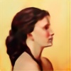
Now choose a reference photo to start with, pick something easy with simple color. A basic photo of an apple or bowl or any single object will do. Open the photo in illustrator and then lock layer 1. Make a new layer to start working on.
The first step is to use the pen tool to draw a series of shapes that define the reference image. Break these up into smaller shapes that correspond to any divisions in the object or changes in direction or shape. It is important to make sure that they shapes overlap so you can get as seamless transition between mesh areas.

Once you have defined the basic shapes associated with your photo, it is time to create the gradient mesh. The only function of the gradient mesh tool is to add or delete mesh lines and points. That’s all. Start with one of your shapes and using the gradient mesh tool, click diagonally across the shape. Each click will add a horizontal and vertical mesh line. Don’t worry you can add and delete mesh lines anytime so it doesn’t have to be perfect. Try to keep the mesh lines evenly spaced if possible but you will need more mesh lines in areas where the color changes a lot and less in areas of flat, unchanging color.
To add a new mesh grid just click. To delete a mesh line, select the line and press alt/option when clicking with the mesh tool. If you delete a point it will delete both the horizontal and vertical mesh lines. If you only want one of the lines deleted, make sure to click on the line in between two points.
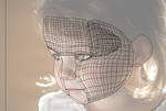
Now we are going to fill the entire shape with the most obnoxious color you can find. This step will be important to being able to see your progress. Using the selection tool, select the entire shape and apply a bright color to the entire shape. Now Im going to show you a neat shortcut, command/control Y will change the view from preview to outline. This will show a wireframe version of the mesh and allow you to see the color in the reference photo. To switch back into preview mode at anytime to see your progress just hit command/control Y again. Cool trick eh?
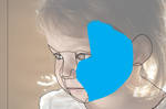
Now lets select an individual point in the mesh. Using the direct select tool (white arrow) make sure you are in outline mode. Click off of the shape off to the side of the artboard to make sure nothing is selected and then select one point. You can tell you only have a single point selected because it should be filled and the other points white.

Now switch to the eyedropper tool (I) and sample the color from the photo right next to the point you selected. To fill the point with that color hit option/alt and backspace/delete at the same time. The point should be filled, to check switch back into preview mode. Now you can see why we applied that obnoxious color, its so you can easily tell what points need to be filled still.

Switch back to outline mode and continue selecting points and applying color to them. I find it is easier to follow one of the lines vertically or horizontally. Be prepared for this to take a very, very long time.
If the color changes look choppy, add more mesh lines to get a smoother transition. When you blend one shape edge into another, I find it helpful to sample to color from the adjacent shape I am blending too rather than the original photo. That’s basically it…. Have fun!
Finished art in outline mode

Finished art in preview mode

One of the trickiest tools to master in Illustrator is the gradient mesh tool but when used correctly it can produce stunning results. There are some tricks to using the gradient mesh with reference photos that will allow you to use the existing color in the photo directly onto the mesh. The technique is simple to use once you understand it. The real issue here is that it soon becomes monotonous so I usually work on a gradient mesh illustration while Im watching a good movie to relieve the boredom!
This tutorial is assuming that you know how to handle the pen tool in illustrator to draw simple shapes. We will be using the pen tool, the direct selection tool, the gradient mesh tool and the eyedropper. It helps if you get used to the shortcuts for these tools as you will be switching between them a lot. Direct Selection tool (A) eyedropper (I), gradient mesh tool (U). Other useful shortcuts to know are switching between outline and preview mode (Command/control Y) and applying fill (Option/alt delete).
Now choose a reference photo to start with, pick something easy with simple color. A basic photo of an apple or bowl or any single object will do. Open the photo in illustrator and then lock layer 1. Make a new layer to start working on.
The first step is to use the pen tool to draw a series of shapes that define the reference image. Break these up into smaller shapes that correspond to any divisions in the object or changes in direction or shape. It is important to make sure that they shapes overlap so you can get as seamless transition between mesh areas.
Once you have defined the basic shapes associated with your photo, it is time to create the gradient mesh. The only function of the gradient mesh tool is to add or delete mesh lines and points. That’s all. Start with one of your shapes and using the gradient mesh tool, click diagonally across the shape. Each click will add a horizontal and vertical mesh line. Don’t worry you can add and delete mesh lines anytime so it doesn’t have to be perfect. Try to keep the mesh lines evenly spaced if possible but you will need more mesh lines in areas where the color changes a lot and less in areas of flat, unchanging color.
To add a new mesh grid just click. To delete a mesh line, select the line and press alt/option when clicking with the mesh tool. If you delete a point it will delete both the horizontal and vertical mesh lines. If you only want one of the lines deleted, make sure to click on the line in between two points.
Now we are going to fill the entire shape with the most obnoxious color you can find. This step will be important to being able to see your progress. Using the selection tool, select the entire shape and apply a bright color to the entire shape. Now Im going to show you a neat shortcut, command/control Y will change the view from preview to outline. This will show a wireframe version of the mesh and allow you to see the color in the reference photo. To switch back into preview mode at anytime to see your progress just hit command/control Y again. Cool trick eh?
Now lets select an individual point in the mesh. Using the direct select tool (white arrow) make sure you are in outline mode. Click off of the shape off to the side of the artboard to make sure nothing is selected and then select one point. You can tell you only have a single point selected because it should be filled and the other points white.
Now switch to the eyedropper tool (I) and sample the color from the photo right next to the point you selected. To fill the point with that color hit option/alt and backspace/delete at the same time. The point should be filled, to check switch back into preview mode. Now you can see why we applied that obnoxious color, its so you can easily tell what points need to be filled still.
Switch back to outline mode and continue selecting points and applying color to them. I find it is easier to follow one of the lines vertically or horizontally. Be prepared for this to take a very, very long time.
If the color changes look choppy, add more mesh lines to get a smoother transition. When you blend one shape edge into another, I find it helpful to sample to color from the adjacent shape I am blending too rather than the original photo. That’s basically it…. Have fun!
Finished art in outline mode
Finished art in preview mode
Join the community to add your comment. Already a deviant? Log In
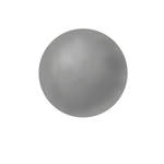
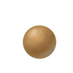
Sphere demo
This is a great way to try digital painting and to get used to two very different methods of digital painting, I will refer to them as glazing and direct painting. I find when teaching this to my students that it is about a 50/50 split as to which method the students prefer. Either method will produce beautiful results.
The reason I start with the sphere is so that students master the techniques on a simple object, but don’t let that fool you. A sphere is a very complex shape when you are first starting out. If you can mater shading a sphere smoothly then you will be well on your way to mastering digital painting. I often suggest students try the sphere exercise several times until they can do it smoothly.
The goal of this exercise is to master the values to produce the illusion that the sphere is three dimensional. If you have ever taken a drawing or painting class, you may have done this exercise before with more traditional materials. There are 6-7 values needed to turn a form and make it look round.

They are as follows:
1. Highlight
2. Halftone/midtone
3. Core shadow
4. Shadow mass
5. Reflect light
6. Cast shadow
These are the values we will be attempting to achieve in the exercises.
Glazing exercise
The glazing technique is similar to the early renaissance painters who would do a complete under-painting in shades of gray (grisaille) before starting the color. The color would then be lightly glazed over this under-painting. It is very important in this technique to fully finish the values of the sphere. You will spend most of your time working on this part. The color will be the easy part and comes later after the values are established completely.
To start, use the elliptical marquee to create a perfectly symmetrical selection (hold down shift while dragging the marquee). Fill this selection with a 50% gray value from your swatches. Lock this layer so you don’t accidently paint on it (we will use it later). Create a new layer to add your values.

To start applying color, choose a hard brush and set the opacity to 20% and the flow to 30% (you may adjust these values to suit your style of painting). Using the lightest gray start blocking in the highlight by hatching strokes of color over the top of the sphere where the imagined light would be hitting it. I then use black to start massing in the shadow values in the second half of the sphere. The midtone values will be 50% gray.

After you have hatched in some starting values, use the smudge tool (I like to set it at 50% pressure but play around with this to get the effect you like). Using the smudge tool, blend your hatching marks together into a smooth value. Apply more hatching marks in all values and continue to use the blend tool to smooth.
At first the values will be rough but after spending a lot of time hatching and smudging you will have a nice value sphere. Now it is time to clean up the edges and apply the color.
To clean up the edges of your sphere where you blended color over the edge, this technique works great. Control or command click on the thumbnail image of the original locked sphere layer. This should give you the oval selection you started with. Make sure you are on your painting layer. Invert the selection (shift command/control I) and then press backspace or delete to remove the overflowed color.
You will use this same selection to apply color to the sphere. Create a new layer and select the layer. Choose a color from the swatches for your sphere and alt delete or option delete to apply the color onto the new layer. Lower the opacity of this layer to glaze the sphere with color . Voila!
Direct Painting Exercise
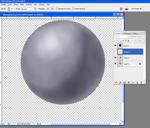
This technique is very different as you will be applying the color from the beginning. Once again we will be starting with the elliptical marquee tool and making a perfectly round selection. Fill this selection with a midtone color, here I have used a middle brown. Lock this layer and create a new layer to paint on.

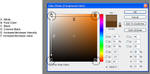
I should quickly point out how the color picker works for those not familiar with it. Each of the four corners contain a color/value as shown in the illustration. Start in the middle of the color picker for your initial value/color for the sphere. To increase or decrease intensity but to keep the same value move directly left or right, to increase or decrease the value move up or down. This is a very sophisticated tool for selecting color once you understand how to use it correctly.
You might also want to familiarize yourself with the spatter brush in Photoshop. It comes as a standard brush. You can see the texture it leaves. I usually experiment with my value/color combinations before I start a painting to establish a palette to work with. Then you can leave this file open and sample color directly from here as you paint.
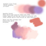
Now select the spatter brush, set opacity to 50% and flow to 30%. I start out with spatter brushes to give the surface of the sphere (or anything) some texture to start out with. The complaint I have with many digital paintings is that the end result has no life and is too smooth. This provides some texture. With the spatter brush set at 50% opacity you will start applying color and value this time, so choose values that are lighter or darker then the overall value of the sphere. You will not be using the smudge tool in this example so keep away from it! All blending will be done by lowering the opacity of the brush.

After you have some values blocked in (light, shadow, midtone, reflect light) you can start dropping the opacity of your spatter brush so that the new strokes blend with the ones below. I will drop it to 25% and then 15% to get rough color.

After you get a good block-in you can switch to a soft brush at 20% opacity to smooth the sphere a bit but be careful not to get rid of all the texture. I have also added the complimentary color into the reflect light to spice things up a bit. Keep in mind this color needs to be part of the shadow so dont go too light. To clean up the edges of the sphere use the same technique of selecting the bottom circle, inverting the selection and deleting the edges.
Have fun!
This is a great way to try digital painting and to get used to two very different methods of digital painting, I will refer to them as glazing and direct painting. I find when teaching this to my students that it is about a 50/50 split as to which method the students prefer. Either method will produce beautiful results.
The reason I start with the sphere is so that students master the techniques on a simple object, but don’t let that fool you. A sphere is a very complex shape when you are first starting out. If you can mater shading a sphere smoothly then you will be well on your way to mastering digital painting. I often suggest students try the sphere exercise several times until they can do it smoothly.
The goal of this exercise is to master the values to produce the illusion that the sphere is three dimensional. If you have ever taken a drawing or painting class, you may have done this exercise before with more traditional materials. There are 6-7 values needed to turn a form and make it look round.
They are as follows:
1. Highlight
2. Halftone/midtone
3. Core shadow
4. Shadow mass
5. Reflect light
6. Cast shadow
These are the values we will be attempting to achieve in the exercises.
Glazing exercise
The glazing technique is similar to the early renaissance painters who would do a complete under-painting in shades of gray (grisaille) before starting the color. The color would then be lightly glazed over this under-painting. It is very important in this technique to fully finish the values of the sphere. You will spend most of your time working on this part. The color will be the easy part and comes later after the values are established completely.
To start, use the elliptical marquee to create a perfectly symmetrical selection (hold down shift while dragging the marquee). Fill this selection with a 50% gray value from your swatches. Lock this layer so you don’t accidently paint on it (we will use it later). Create a new layer to add your values.
To start applying color, choose a hard brush and set the opacity to 20% and the flow to 30% (you may adjust these values to suit your style of painting). Using the lightest gray start blocking in the highlight by hatching strokes of color over the top of the sphere where the imagined light would be hitting it. I then use black to start massing in the shadow values in the second half of the sphere. The midtone values will be 50% gray.
After you have hatched in some starting values, use the smudge tool (I like to set it at 50% pressure but play around with this to get the effect you like). Using the smudge tool, blend your hatching marks together into a smooth value. Apply more hatching marks in all values and continue to use the blend tool to smooth.
At first the values will be rough but after spending a lot of time hatching and smudging you will have a nice value sphere. Now it is time to clean up the edges and apply the color.
To clean up the edges of your sphere where you blended color over the edge, this technique works great. Control or command click on the thumbnail image of the original locked sphere layer. This should give you the oval selection you started with. Make sure you are on your painting layer. Invert the selection (shift command/control I) and then press backspace or delete to remove the overflowed color.
You will use this same selection to apply color to the sphere. Create a new layer and select the layer. Choose a color from the swatches for your sphere and alt delete or option delete to apply the color onto the new layer. Lower the opacity of this layer to glaze the sphere with color . Voila!
Direct Painting Exercise
This technique is very different as you will be applying the color from the beginning. Once again we will be starting with the elliptical marquee tool and making a perfectly round selection. Fill this selection with a midtone color, here I have used a middle brown. Lock this layer and create a new layer to paint on.
I should quickly point out how the color picker works for those not familiar with it. Each of the four corners contain a color/value as shown in the illustration. Start in the middle of the color picker for your initial value/color for the sphere. To increase or decrease intensity but to keep the same value move directly left or right, to increase or decrease the value move up or down. This is a very sophisticated tool for selecting color once you understand how to use it correctly.
You might also want to familiarize yourself with the spatter brush in Photoshop. It comes as a standard brush. You can see the texture it leaves. I usually experiment with my value/color combinations before I start a painting to establish a palette to work with. Then you can leave this file open and sample color directly from here as you paint.
Now select the spatter brush, set opacity to 50% and flow to 30%. I start out with spatter brushes to give the surface of the sphere (or anything) some texture to start out with. The complaint I have with many digital paintings is that the end result has no life and is too smooth. This provides some texture. With the spatter brush set at 50% opacity you will start applying color and value this time, so choose values that are lighter or darker then the overall value of the sphere. You will not be using the smudge tool in this example so keep away from it! All blending will be done by lowering the opacity of the brush.
After you have some values blocked in (light, shadow, midtone, reflect light) you can start dropping the opacity of your spatter brush so that the new strokes blend with the ones below. I will drop it to 25% and then 15% to get rough color.
After you get a good block-in you can switch to a soft brush at 20% opacity to smooth the sphere a bit but be careful not to get rid of all the texture. I have also added the complimentary color into the reflect light to spice things up a bit. Keep in mind this color needs to be part of the shadow so dont go too light. To clean up the edges of the sphere use the same technique of selecting the bottom circle, inverting the selection and deleting the edges.
Have fun!
Join the community to add your comment. Already a deviant? Log In


Join the community to add your comment. Already a deviant? Log In